43221 Darlington, Queen Elizabeth

43221 Darlington, Queen Elizabeth

Thursday 31 March 2011

Evaluation Question 4 - Who would be the audience for your media product?

Above is a visual representation of who my audience is for my media product. The poster includes music interests, common hobbies, fashion brands, target age and the gender of my audience.
From this and my original audience research, I devised that my audience would be proportionally divided into male and females, with a larger proportion of 60% being male and 40% to female. From the content of my image, it includes a varied range of photography including both male and female. I found that males are more likely influenced by dominant and powerful male figures and aspire to be like them, but also enjoy female presense as the genre of music conforms to objectifying them as sexual icons. Likewise, females also find this technique appealing with male photography.
With age, my audience generates between 15-28 which is admitidly a young audience, but with this generation - they are most likely to be easily influenced which is important when creating a media product.

Tuesday 29 March 2011

Evaluation Question 3 - What kind of media institutions might distribute your media product and why?


Above is a cartoon made on www.pixton.com - which illustrates the production process that most media distributers will carry out whilst producing their media products.

Evaluation Question 2 - How does your media product represent particular social groups?

Above is a video presentation I have created which outlines and underpins the stereotype which is the 'Scene Kid' social group and which I have tried to replica and represent in my own media product. The video includes un-copy righted music and images of bands and artists that are associated with the rock/pop genre of music, along with images from google of stereotypical scene kids.


The image above is a wordel, creating by a piece of text describing the 'scene kid' stereotype. Depending on the size of the word, it represents which words are most likely associated regularly with the social group, for example; music, coloured and clothing are a few of the most common ways scene kids are represented. 

Evaluation Question 1 - In what ways does your media product use, develop or challenge forms and conventions of a real media product?


Friday 18 March 2011

Final Products


Final Products
Above are my final JPEG images of my finished final products. 

Tuesday 8 March 2011

Rough Cut Improvements - From Feedback

The image to the left is an screen dump of my improved version of my contents page. From my pitch feedback that I received, I have added in the following to my magazine:
Contents Page
  • Subscription details: email, contact address - also specifications for subscription ( Full name, address, age and payment of £5.99 a month)
  • The magazine's website - this adds to the professionalism of the magazine, to also have a website.
  • An 'In This Issue' title - to inform the audience what they can expect to read about in the issue of the magazine.
  • I have also altered some of the buy lines in my contents, to make them easier to read and to look less cluttered on the page. From my magazine research, I found that this is the most popular method of layout for a magazine of my genre, as the content is organised into sections which allows readers to find exactly what they are looking for, quickly and easy. 
Front Cover
Above is an improved version of my front cover. From my pitch feedback, it was suggested that I added more sell lines, a few more colours and maybe alter some of the photos across the banner. Therefore, I have;

  • Added a new sell line, 'Download Festival' which corresponds with my genre of music, as it is a successful annual rock festival, similar to Leeds and Reading. 
  • I have also removed one of the photos on my banner - which I also featured on my contents page, and used a brighter coloured photograph of All Time Low. This adds a blue and green colour to the banner - making it more vibrant and stand out to the readers. 
  • Used the rubber tool to make the mast head appear to be behind the models heads, rather than infront. This effect represents that the band on the front are a main part of the magazine and the photograph portrays this. 
  • Added more brushes to a given effect - which adds colour, makes it more vibrant and stand out more.
My feedback suggested that I brightened this image and to possibly insert a headline or an introductionary phrase, as it looked to bare. Therefor, from my feedback, I have:
  • Added the phrase 'They're here, They're new and They're Loud' which relates to my genre of music and the name of my magazine, of being loud and alarming. It also introduces the band to be new and up - coming which advertises them in my magazine. I used my conventional font of 'LaPresse' which matched the font I have already used on my double page spread.
  • Altered the shadow and highlighting of my image, which altered any shadows that had occurred during taking the photo. I also altered the brightness and contrast of the image, which made my model stand out more - her hair seem brighter with comparison to my other image and the red brushes seem more alarming and dangerous. This fully fulfils my desired effect I aimed to conjure for my target audience.


Above is my the right page of my double page spread, which contains my article. My feedback suggested:
  • I added a text brake - which I would put a quote insert, to brake the text up so it wasn't to hard to real or full on block text. I did this by highlighting my main quotes for my article, enlarging the font and converting the colour to red. This conforms to my continuos colour pallet for my magazine, and adds more colour to this side of the page. 
  • Added editors and photography notes - I added the models names, from left to right, page numbers and a publication details, entitled 'Volume Magazine Publications 2011'. This adds to my desired professional look of my magazine.

Friday 4 March 2011

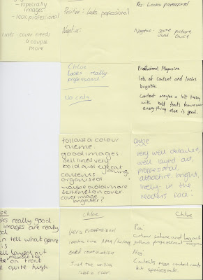
Magazine Rough Cut Feedback


Above is feedback I received from my target audience and peers about my rough cuts of my media product. From the feedback I received, my product was rated good but still needs a few adjustments and improvements to make for my full final product. 

Thursday 3 March 2011

Rough Cuts

The following images are my rough cut designs for my music magazine.I have designed a front cover, a contents page, and a double page spread.