Friday 15 April 2011

Thursday 14 April 2011
Evaluation Question 7 - Looking back at your preliminary task, how have you progressed from production of it to full product?
Question 7
View more presentations from chloespears1


Learn how to draw cartoons, comics, and anime at Sketchfu!

Learn how to draw cartoons, comics, and anime at Sketchfu!

Learn how to draw cartoons, comics, and anime at Sketchfu!
The sketches above outline some of the techniques I have learnt during the production process of my full product, such as; setting up photoshoots- positioning and framing correctly using lighting and angled shots, designing costumes and make up for my model, along with props and creating a 'the look' to fit stereotypes of my audience and use a larger range of technologies correctly to produce a professional looking media product.
Sunday 10 April 2011
Evaluation Question 6 - What have you learnt about technologies from the process of constructing this product?
GoAnimate.com: Evaluation Question 5 by chloespears1
Like it? Create your own at GoAnimate.com. It's free and fun!
The above animation covers a range of technologies I have used during the production process of my product. Some other online technologies are; wwww.pixton.com - which I used to create an online cartoon which illustrated the production process of producing a media product. www.goanimate.com which I created the animation above, using different characters and voices to read a written script. www.glogster.com to produce an online mood board of my target audience, which included images and texts which clearly identified who my target audience are. www.slideshare.com allowed me to upload powerpoint presentations and embed them into my blog. www.polljunkie.com which I used to create a quick poll, which I sent to my target audience for feedback of my product www.youtube.com I used to upload my own created video's and allowed comments and feedback. www.blogger.com which I have used as an online diary to record and keep my progress in chronological order.
During the production process I have used these technologies which have allowed my to maximise the potential of my product, whilst gaining and acquiring skills that an professional media producer would use whilst producing a real media product like mine. I have learnt the production process and learned to perceiver with technologies in order to 'get the job done' and produce a product that I am satisfied in conforming to professional conventions of a media product and the rock/pop genre of music.

Friday 8 April 2011
Evaluation Question 5 - How did you attract/address your audience?
Question 5 on Prezi
The prezi also includes a video of feedback from my target audience - outlining how they are attracted/appealed to my media product, pro's and con's of the product and whether they would purchase it.
The prezi also includes a video of feedback from my target audience - outlining how they are attracted/appealed to my media product, pro's and con's of the product and whether they would purchase it.
The link below is a quick poll designed to ask my target audience brief questions of what they think of my media product. I sent this poll to a large group of my target audience, of 'indie scene kids' through email and Facebook - as this is a popular method communication and socialising method used. The results of the poll can be viewed after you have voted and give a rough generalisation of what my target audience think of my media product.
Thursday 31 March 2011
Evaluation Question 4 - Who would be the audience for your media product?
Above is a visual representation of who my audience is for my media product. The poster includes music interests, common hobbies, fashion brands, target age and the gender of my audience.

From this and my original audience research, I devised that my audience would be proportionally divided into male and females, with a larger proportion of 60% being male and 40% to female. From the content of my image, it includes a varied range of photography including both male and female. I found that males are more likely influenced by dominant and powerful male figures and aspire to be like them, but also enjoy female presense as the genre of music conforms to objectifying them as sexual icons. Likewise, females also find this technique appealing with male photography.
With age, my audience generates between 15-28 which is admitidly a young audience, but with this generation - they are most likely to be easily influenced which is important when creating a media product.
Tuesday 29 March 2011
Evaluation Question 3 - What kind of media institutions might distribute your media product and why?
Question 3 - What kind of media institutions might distribute your media product and why?
View more presentations from chloespears1
Above is a cartoon made on www.pixton.com - which illustrates the production process that most media distributers will carry out whilst producing their media products.
Evaluation Question 2 - How does your media product represent particular social groups?
Above is a video presentation I have created which outlines and underpins the stereotype which is the 'Scene Kid' social group and which I have tried to replica and represent in my own media product. The video includes un-copy righted music and images of bands and artists that are associated with the rock/pop genre of music, along with images from google of stereotypical scene kids.


The image above is a wordel, creating by a piece of text describing the 'scene kid' stereotype. Depending on the size of the word, it represents which words are most likely associated regularly with the social group, for example; music, coloured and clothing are a few of the most common ways scene kids are represented.
Evaluation Question 1 - In what ways does your media product use, develop or challenge forms and conventions of a real media product?
Question 1 - In what ways does your media product use, develop or challenge forms and conventions of real media products on Prezi
The above prezi highlights how I have used conventions of a real product in my own media product and how this had made it appeal to the its target audience.
The above prezi highlights how I have used conventions of a real product in my own media product and how this had made it appeal to the its target audience.
Friday 18 March 2011

Tuesday 8 March 2011
Rough Cut Improvements - From Feedback
The image to the left is an screen dump of my improved version of my contents page. From my pitch feedback that I received, I have added in the following to my magazine:

 Above is an improved version of my front cover. From my pitch feedback, it was suggested that I added more sell lines, a few more colours and maybe alter some of the photos across the banner. Therefore, I have;


Contents Page

- Subscription details: email, contact address - also specifications for subscription ( Full name, address, age and payment of £5.99 a month)
- The magazine's website - this adds to the professionalism of the magazine, to also have a website.
- An 'In This Issue' title - to inform the audience what they can expect to read about in the issue of the magazine.
- I have also altered some of the buy lines in my contents, to make them easier to read and to look less cluttered on the page. From my magazine research, I found that this is the most popular method of layout for a magazine of my genre, as the content is organised into sections which allows readers to find exactly what they are looking for, quickly and easy.
Front Cover

- Added a new sell line, 'Download Festival' which corresponds with my genre of music, as it is a successful annual rock festival, similar to Leeds and Reading.
- I have also removed one of the photos on my banner - which I also featured on my contents page, and used a brighter coloured photograph of All Time Low. This adds a blue and green colour to the banner - making it more vibrant and stand out to the readers.
- Used the rubber tool to make the mast head appear to be behind the models heads, rather than infront. This effect represents that the band on the front are a main part of the magazine and the photograph portrays this.
- Added more brushes to a given effect - which adds colour, makes it more vibrant and stand out more.

My feedback suggested that I brightened this image and to possibly insert a headline or an introductionary phrase, as it looked to bare. Therefor, from my feedback, I have:
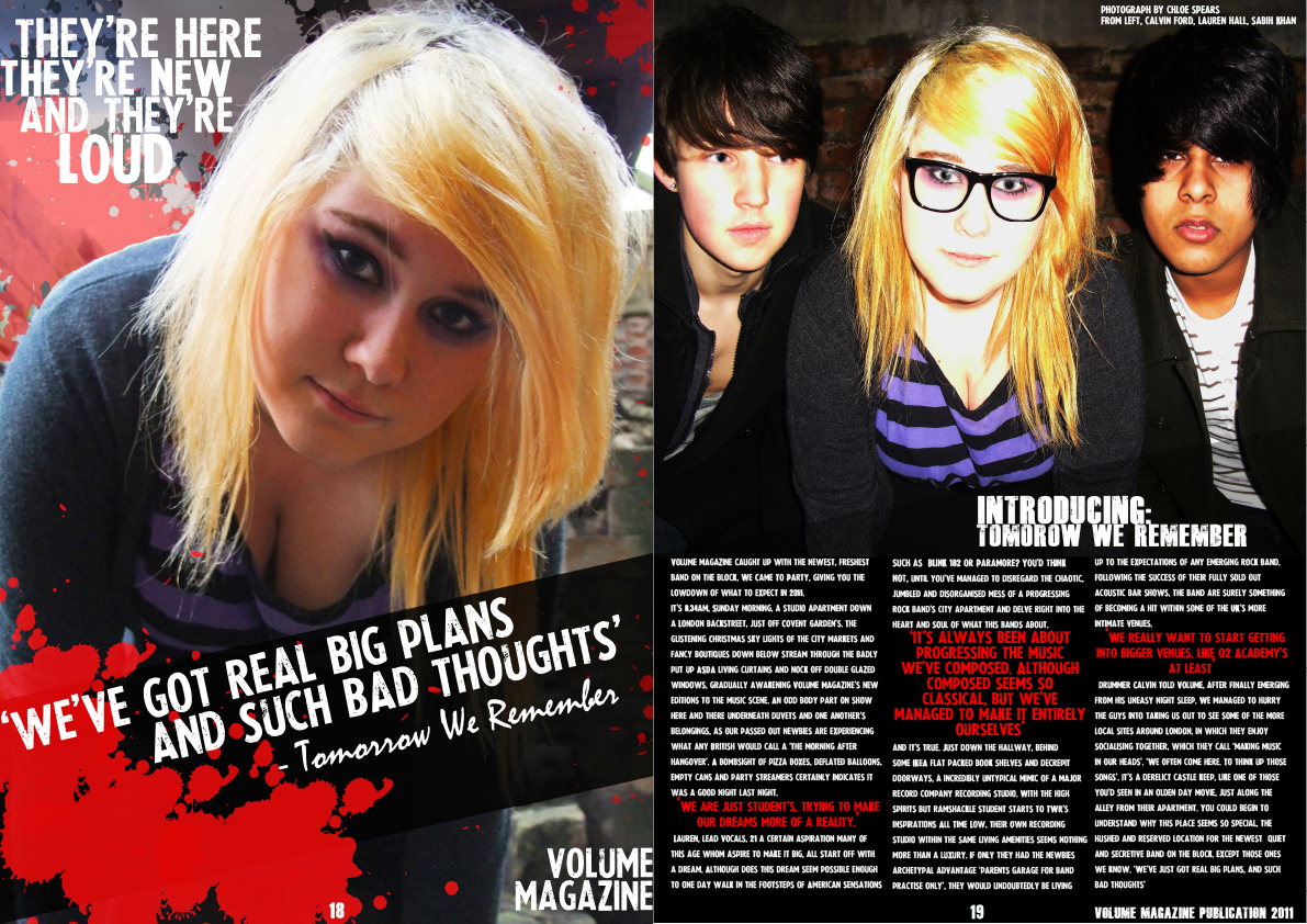
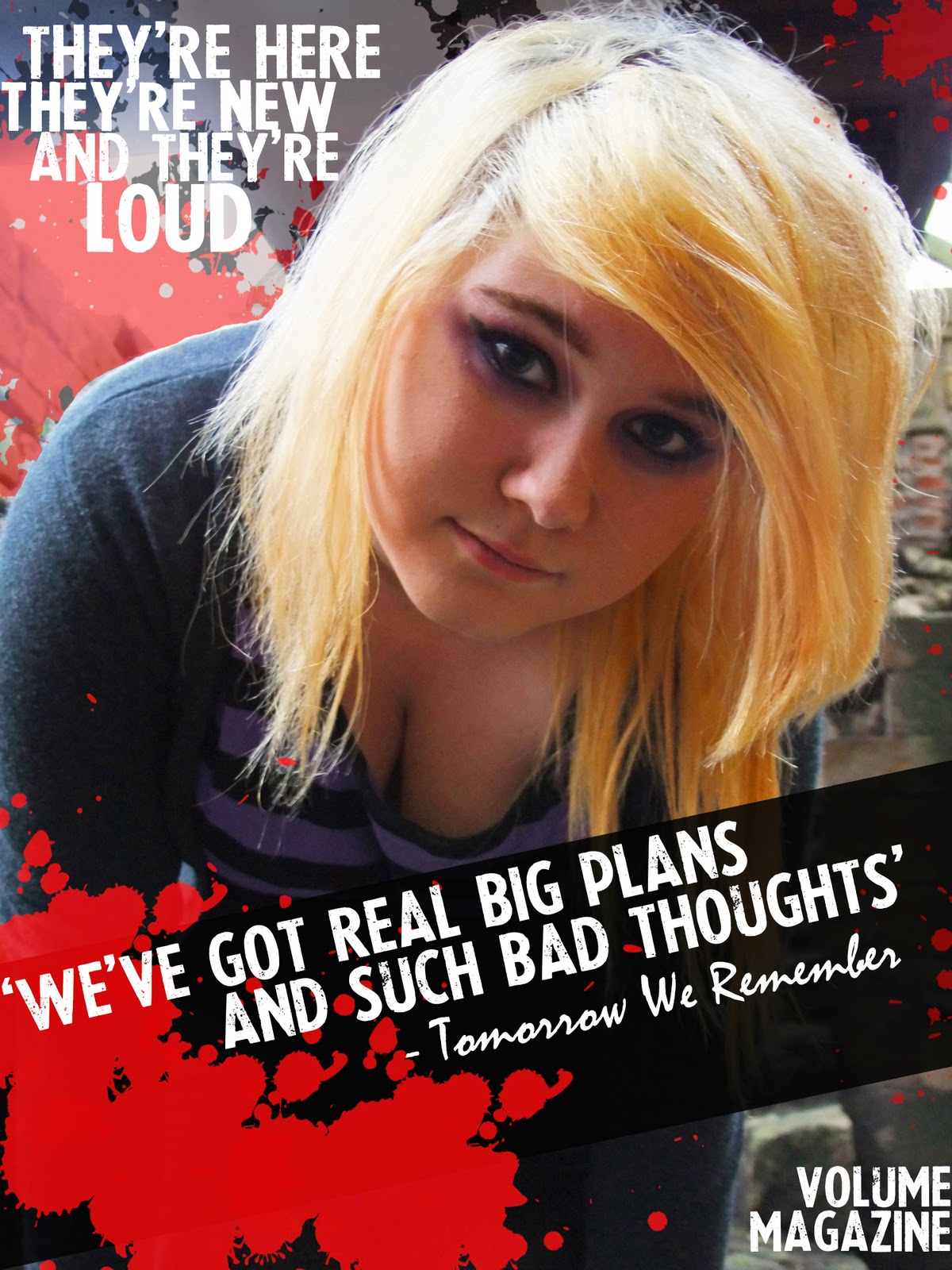
- Added the phrase 'They're here, They're new and They're Loud' which relates to my genre of music and the name of my magazine, of being loud and alarming. It also introduces the band to be new and up - coming which advertises them in my magazine. I used my conventional font of 'LaPresse' which matched the font I have already used on my double page spread.
- Altered the shadow and highlighting of my image, which altered any shadows that had occurred during taking the photo. I also altered the brightness and contrast of the image, which made my model stand out more - her hair seem brighter with comparison to my other image and the red brushes seem more alarming and dangerous. This fully fulfils my desired effect I aimed to conjure for my target audience.

Above is my the right page of my double page spread, which contains my article. My feedback suggested:
- I added a text brake - which I would put a quote insert, to brake the text up so it wasn't to hard to real or full on block text. I did this by highlighting my main quotes for my article, enlarging the font and converting the colour to red. This conforms to my continuos colour pallet for my magazine, and adds more colour to this side of the page.
- Added editors and photography notes - I added the models names, from left to right, page numbers and a publication details, entitled 'Volume Magazine Publications 2011'. This adds to my desired professional look of my magazine.
Friday 4 March 2011
Magazine Rough Cut Feedback


Above is feedback I received from my target audience and peers about my rough cuts of my media product. From the feedback I received, my product was rated good but still needs a few adjustments and improvements to make for my full final product.
Thursday 3 March 2011
Rough Cuts
The following images are my rough cut designs for my music magazine.I have designed a front cover, a contents page, and a double page spread.


Thursday 17 February 2011
Double Page Spread Photography - During Production
Model: Lauren Hall
Below is two images that I will use for my double page spread. The first, show two versions of the image I intend to use for my main A4 spread, on the left hand side of the double page. I have chosen to use a medium close up of my main female singer, to introduce the readers to ideologies about her dominance and status within the band. Along with this, it challenges gender stereotypes . The image renders her as sexual icon to a young male audience, which is perceived through her positioning, pose, costume and make up. Her low cut top, long flowing hair and large amount of make up reinforces her sexual prerogative and reinforces gender stereotypes. From my research, I found similar images which conform to these stereotypes, such as Hayley Williams from Paramore and Cassade Pope from Hey Monday.
Examples of this:

The image below is an edited version of my main raw image, in which I have inserted a black banner diagonally across the image. I have altered the opacity of the banner, so the reader is still able to recognize the image underneath. I have also used a quote from my article, which is in white font, with red paint splashes which adds colour and vibrance to the image.

The image below is a further edited image, which I constructed after my pitch feedback - which was to brighten the full image, add more brushes and a title at the top of the page. Whilst doing this, I found this introduced the band featured much more clearer, as it was now at the top of the page. It also stands out more, and hides some of the original dull location background.
Models: Calvin Ford, Lauren Hall, Sabih Khan
The other is a medium close up all 3 band members, which allows the audience to recognize the other members of the band, along with the main female lead singer. Also, on the other photograph, we can recognise that her eyeline shows direct address with the reader. This engages the reader to feel the photograph was taken for them, therefor involving them in the magazine. With the other two members, stereotypical representations of band members of this genre are also present. On the left, the models eye line is not direct address, which challenges the readers perseption, which suggests he is daring, fun and exciting and possibly childlike. On the right, the model represents the dominant male role, direct address and sleek and smart hair suggests he is a flirt, a ladies man which immediatly appeals to an female audience for my magazine.

Contents Page Photography - During Production
The following images are two of the images I have used on my contents page of my magazine. The top image is a landscape medium close up of a 3 membered band, which are a feature of my magazine. The image challenges many stereotypes which are produced by my chosen genre of music, which tend to be : male orientated, dominant and threatening. My image features a new and up coming female orientated band, which through the use of costumes and make up - marginally reinforces the main image produced of the genre, but yet still challenges gender stereotypes.
Models: Jenny Lee, Emily O'Hara, Emily Boyd

The image below is the image of the band I am using on my double page spread. Unlike the previous image, the photograph more intentionality conforms to reinforcing typical stereotypes of female and male dominance within a band. Although it challenges male dominance, it also conforms to females being less dominant as the lead females eye line is lower than the higher rule of thirds and below her fellow band members. This renders her less dominant, which could suggest she is perceived as a sexual icon to a younger male audience, aswel as her fellow band members. This is reinforced through the use of her costume, as it represents her sexual prerogative, as she is wearing a low cut top with long flowing hair and a large, vibrant amount of make up.
Models : Calvin Ford, Lauren Hall, Sabih Khan

Live Model : Travis Clark
The photo below was taken at an We The Kings concert in February, on my SLR camera. The image is a medium close up of the lead singer, mid shot on stage. I decided to use this image as it shows a live, real band performing on stage, which from my research, would be found in an professional working magazine, such as Kerrang and Rocksound.

Live Model : Sean Smith
This image was taken at an The Blackout concert in December 2010, on my own SLR camera. Like the image above, it is also a medium close up shot, but from a right angel. I also decided to use this image is it shows a real life, live performance shot from a concert, which would be likely to be used in an working professional music magazine.

Front Cover Photography - During Production
Some photography shots I have taken myself, of featuring bands or artists of my magazine. All 3 shots are live shots from concerts I have been to, which have been taken on an SLR camera. The top two are medium close ups of lead singers, from All Time Low, The Blackout and Elliot Minor. I decided to use these photographs as they represent the live and reality of a band within the rock/Independent genre of music, which I aim to recreate within my magazine. Also, from my research, this is a popular method and feature that is used in magazines such as Q, NME, Rocksound and Kerrang!
Live Model: Sean Smith
Live Model: Alex Gaskarth


Live Model : Alex Davies and Ed Hetherton
Main photography analysis:
The image below is the image I decided to use for the main image of my front cover. I decided to use this image as it follows the conventions of photography that popular magazines of my genre use. It is a medium close up of my three models, which are a featured band of my magazine. It also conforms to stereotypes with using a lead female singer, by positioning her center, with direct address to the reader. This engages the reader to feel the photograph was taken for them. The two male models behind are positioned in a triadic structure, which exhibits them as less dominant as the female.
Model: Josh Wallace, Jenny Lee, George Sweeton
Model: Josh Wallace, Jenny Lee, George Sweeton

The image below is a landscape medium close of up the same models. I decided I couldn't use this image for my front cover as it is the wrong orientation and would not fit comfortably onto my cover of my magazine. Also, on this image, my two male models are further spaced out, which contradicts stereotypes for bands being 'close and dependant' on one another, of this genre.

The image below is a single medium close up shot of the lead female singer from my featuring band. Although this image conforms to stereotypes of dominant femininity within bands that fall into this genre, I decided not to use this image for my front cover, as I felt it dis-regards and ignores the other members. Also, from my research, I was un-succesful in finding a front cover example from either Kerrang! or Rocksound that featured just the lead female singer on the front cover, if done so, it would be a male lead singer instead.
Model : Jenny Lee

During production on Front Cover on Photoshop

For my front cover, I have used a medium close up shot of a featuring band, 'We Came To Party' - which I created myself, for my main image. The image features a lead female singer and two male members. With the positioning, I have placed her in front of the two males, which reinforced dominant ideologies about lead singers being overpowering, most popular and in the limelight. Her long flowing red hair also stands out and looks alarming, which jumps of the page at the readers. This also connotates a passion for music, along with danger and angst, which is a popular and stereotypical for the rock/independent genre of music. Her costume also contrasts with this, following a very/rock independent costume of checkered shirts and black printed shirts underneath. For the two males, they are placed in a pyramid structure behind her, promoting her status over them. Their facial expressions exhibit an professional and serious tone to the photography, which sets the tone of the band.
Tuesday 8 February 2011
Action Plan
Week commencing 7th February.
This week I am starting my production on my magazine. I have a rough cut deadline for Wednesday 2nd March to work towards. Therefor, I must organise my time as follows:
Article Drafts - Monday 14th February
I have set myself this deadline as I feel I will be able to research, plan and create a rough draft of my article for my DBS by this time.
Photography - Wednesday 16th February
I have set myself this deadline as I feel it is a reasonable length of time to get my photography done from now - considering I am doing location and studio shoots. (I have also already done my double page spread photo's) Alongside this, I think I will also be able to start construction my DBS and Contents page.
Double Page Spread and Contents Construction - Friday 18th February
I have set myself the deadline of this date, as I feel this deadline is something I can be working on after I have my article draft, and then my photography following. I will also be able to create a structure and layout for these before hand, and then insert my photography and article once finished.
I have set myself the deadline of this date, as I feel this deadline is something I can be working on after I have my article draft, and then my photography following. I will also be able to create a structure and layout for these before hand, and then insert my photography and article once finished.
Front Cover Construction - Wednesday 23rd February
I have set myself this deadline as I can continue constructing my front page over the holidays at home, with photoshop at home. I also feel this is long enough time between constructing my DPS and Contents in order to meet these deadlines.
Final Construction - Tuesday 1st March
I have set myself this deadline for final construction to be met, as it allows any time for quick last minute editing before the overall deadline on the 2nd.
Monday 7 February 2011
Article Drafts
Volume magazine caught up with the newest, freshest band on the block, We Came To Party, giving you the lowdown of what to expect in 2011.
It's 8.34am, Sunday morning, a studio apartment down a London backstreet, just off Covent Garden’s. The glistening Christmas sky lights of the city markets and fancy boutiques down below stream through the badly put up ASDA living curtains and nock off double glazed windows, gradually awakening Volume Magazine's new editions to the music scene. An odd body part on show here and there underneath duvets and one another’s belongings, as our passed out newbies are experiencing what any British would call a ‘the morning after hangover’. A bombsight of pizza boxes, deflated balloons, empty cans and party streamers certainly indicates it was a good night last night. 'We are just student's, trying to make our dreams more of a reality.' – Lauren, lead vocals, 21- a certain aspiration many of this age whom aspire to make it big, all start off with a dream. Although does this dream seem possible enough to one day walk in the footsteps of American sensations such as Blink 182 or Paramore? You’d think not, until you’ve managed to dis-regard the chaotic, jumbled and disorganised mess of a progressing rock band’s city apartment and delve right into the heart and soul of what this bands about. ‘It’s always been about progressing the music we’ve composed. Although composed seems so classical, but we’ve managed to make it entirely ourselves’ and it’s true. Just down the hallway, behind some IKEA flat packed book shelves and decrepit doorways, a incredibly untypical mimic of a major record company recording studio. With the high spirits but ramshackle student starts to WCTP’s inspirations (All Time Low), their own recording studio within the same living amenities seems nothing more than a luxury. If only they had the newbies archetypal advantage; ‘parents garage for band practise only’, they would undoubtedly be living up to the expectations of any emerging rock band. ‘That’s so American, in the UK, we aim for the best. And that’s exactly what we’re aiming for’.
Following the success of their fully sold out acoustic bar shows, the band are surely something of becoming a hit within some of the UK’s more intimate venues. ‘We really want to start getting into bigger venues, like O2 Academy’s at least’ drummer Dan told Volume, after finally emerging from his un-easy night sleep. Considering the band’s exclusive and diverse style, they are surely heading for success, with the abilities to record and produce their own music, it’s only a matter of time before these guy are recognised by a popular independent label.
We managed to hurry the guys into taking us out to see some of the more local sites around London, in which they enjoy socialising together, which they call ‘making music in our heads’.
‘We often come here, with a mission. To think up those songs’. It’s a derelict castle keep, like one of those you’d seen in an olden day movie, just along the alley from their apartment. You could begin to understand why this place seems so special, the hushed and reserved location for the newest quiet and secretive band on the block. ‘That’s just it. We are a bit like a secret to the music scene, as nobody in the real world, out there, knows who we are what we are doing yet. Except those ones we know. We’ve just got real big plans, and such bad thoughts’.
The article above is just a draft of how my article will be structured, but is a basic example which I plan to change when putting my article into my product. I am aware that my article would be too long for a double page spread and stretches more to be of a full length feature instead. I will therefor edit and cut out the important information, quotes and details which will be important for my article.
Article Research + Planning
From my research, I have found that both Kerrang! and RockSound magazine feature mainly two different types of articles that are published within the magazine.
One is in a style of an interview - a series of question and answers between the interviewer and interviewee (the band/artists ect..). Sometimes it can features just the lead singer/artists of a band, occasionally some are structured to have replies from all the members instead.
The questions are usually planned to be a mixture of planned questions, other with spontaneous and improvising to the interviewee's repsonse. The interviewer's parts are written in third person, with the use of 'you' to direct the questions towards the the interviewee's. The band/artists's responses will be in third person, as they are direct responses from them.
An example of this is below:
Kerrang! Interview - Young Guns

The other tends to be a 'personality sketch' followed by with reviewing the artists/bands recent achievement's, a live gig or an album release. Usually these include certain direct quotes from the interviewee in appropriate places, to grab the readers attention and to support the information that the magazine are providing. Similarly, an interview is took place before hand, in order for the journalist to create a review, but the structure and questions are not included. Like an interview, it will be mainly written in third person, referring to the band/artist as 'they' or 'them'.
An example of an interview from RockSound and Kerrang! magazine is below:


One is in a style of an interview - a series of question and answers between the interviewer and interviewee (the band/artists ect..). Sometimes it can features just the lead singer/artists of a band, occasionally some are structured to have replies from all the members instead.
The questions are usually planned to be a mixture of planned questions, other with spontaneous and improvising to the interviewee's repsonse. The interviewer's parts are written in third person, with the use of 'you' to direct the questions towards the the interviewee's. The band/artists's responses will be in third person, as they are direct responses from them.
An example of this is below:
Kerrang! Interview - Young Guns

Young Guns popped into the Kerrang! office this week to have a little chat about next week's Kerrang! Tour.
The lads took some time out with this week's work experience Liv Swann for a natter about the upcoming dates.
Check out the interview below!
Kerrang!: Any “rock-star-diva” requests for your rider?
GUS (vocals): “No, because they probably won’t be granted even if we asked for them!”
BEN (drums): “Just any beer and any water.”
GUS: “If I could have my own little safe to keep my own allowance of beers in, ‘coz I don’t drink till after we’ve played, and these guys just drink all the time. It’s slowly becoming my pet hate on tour. I need my own little separate diva allowance, that would be nice.”
SI (bass): “Like a little lunch box.”
GUS: “Yeah, just like a Fisher Price one.”
For a double page spread, articles can range between 6-12 questions, depending on the length of the response. Usually, they are long and explicatory, which keeps the reader interests and hooked. The word count differs between article to article. For and interesting and griping article, the count tends to be a lot longer than 1000 words, where as some quick snappy, 'get to know you' type interviews contain less than 500 words.
An example of an interview from RockSound and Kerrang! magazine is below:

World exclusive 30 Seconds To Mars interview!
Tomorrow's Kerrang! magazine features a world exclusive interview with 30 Seconds To Mars. We join the band in the studio as they put the finishing touches to the follow-up to their 2005 breakthrough album, A Beautiful Lie.
30 Seconds To Mars have been working with producer Flood (Nine Inch Nails, Depeche Mode, Smashing Pumpkins) at The International Centre For The Advancement Of The Arts And Sciences Of Sound in the Hollywood Hills and, according to frontman Jared Leto, the band have penned a staggering 120 songs for the new release.
"I'd get up and sometimes a song would just come," Leto told K!. "It would just happen. Generally if I sat down at the piano or picked up a guitar, a song would arrive. But every song is different and that's what makes it exciting and that's what makes it interesting. Every song has its own rules - some come quick; you have to beat the living shit out of others. The important thing to know is that the record is nearly finished."
Though a release date has yet to be set for the new album, Leto reveals that he and brother / drummer Shannon and guitarist Tomo Milicevic have distilled the 120 tracks down to just 20.
Leto also went on to reveal what the new album will be called:
"Want to know the working title of the album?" he asked Kerrang!. "Well, I'm going to give it to you. I did this before and I got in trouble and I probably shouldn't tell you this, but the title as it stands is... This Is War!"
For the full interview, be sure to pick up a copy of tomorrow's Kerrang! magazine
Friday 4 February 2011
Photoshoot Set Up Flat Plans

Photoshoot Set Ups
The image above is a photoshoot flat plan for my photoshoot in the studio. It was set up with a three point lighting set up, with the model positioned in the centre. This would allow the light to reflect and avoid causing a shadow when taking the photo. The camera is then placed directly infront of the model, and will be altered higher or lower between shots. This will add either a high or low angled shot, which will alter the dominance and image I am trying to portrey in the photograph.
Location Recce
Location Recce

For two of my images, I will be using the studio with a lighting set up. The following images are of the studio, showing it's size, location and possible hazards that it may include. From the images, is it clear that the photography studio is a safe, hazord free working environment in which I can use to take my photos for my magazine. Also by using this location, it allows me to shoot with a white drop background - which I intend to use for the photography on the front cover of my magazine. Moreover, it is possible to use this location.


Hazard Evaluation and Risk Assessment.
The two forms below are my Hazard Evaluation forms my photography location Recce. The first is for the Castle Keep (Newcastle), where I shoot my photoshoot for my double page spread photography. From my evaluation, I found there were only 3 possible hazards which may restrict the profeciency and saftey of my models during this photoshoot. They were; manual handling, costume and make up, weather. From shooting on location, the weather is always a factor that will effect how my photography will end up. Fortunatly, the weather was suitable for how I wanted to represent my genre in my magazine. The costume and make up were also able to be done, at a nearby indoor location, not too far from my shooting location. After shooting, manual handling was no longer an current hazard, as the location was left derlict and there were no props or different equiptment needed.


Subscribe to:
Posts (Atom)